Fearless John

Full Circle Case

Thornton Group

A seriously “cool” assignment.

Under its old name I.C.T.C., this Antwerp port company spent sixty years growing into an established name in the world of reefer containers. Over the years, more and more activities and services were added: spares, repair, sales & rental, projects and flexitanks. Five fields of expertise, five companies, five stories. And so five logos, five colour schemes and five different images too.

A group of companies in full expansion needed a new identity.

The story in four chapters.

“Bring five fields of expertise together under one strong brand.”

The call

Our brief: a complete rebrand that brings order to a complex group structure.

Because however different the activities were, they shared the same roots, the same clients and the same ambition.

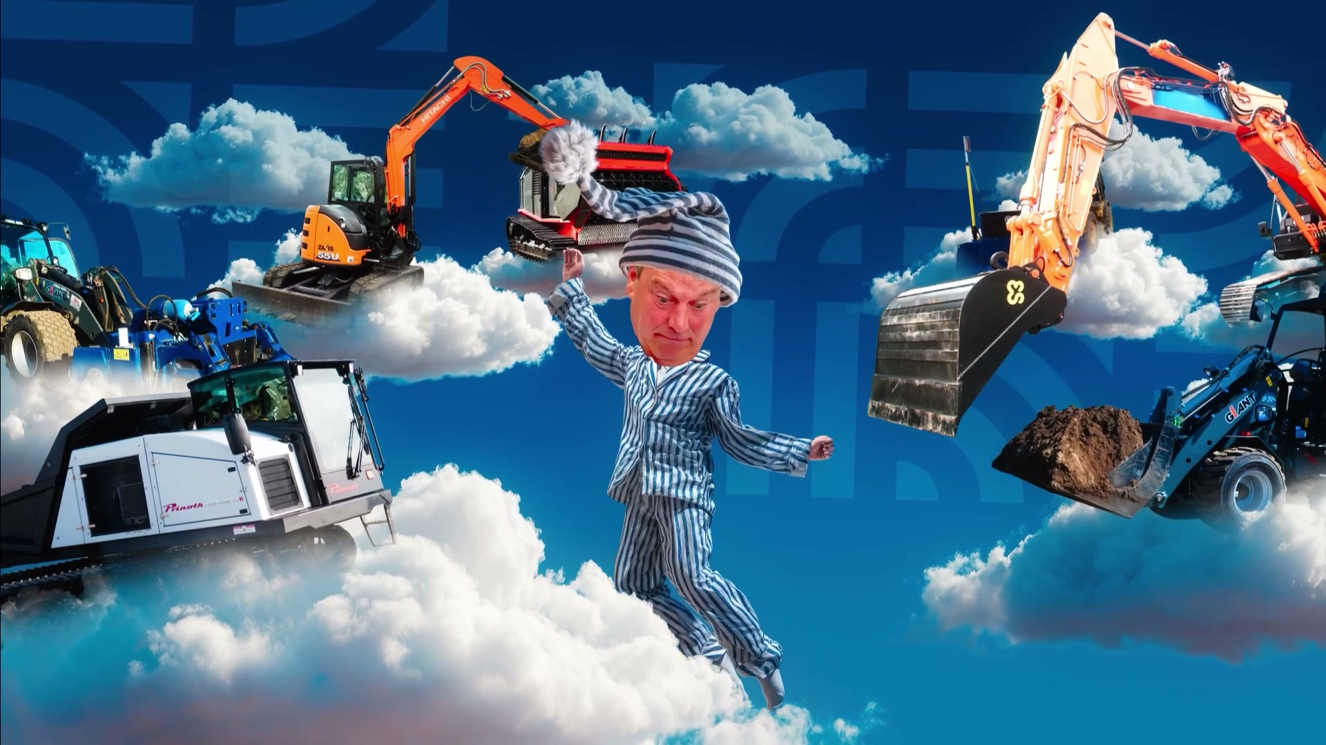
So the challenge wasn't to erase the differences, but to connect them in a way that makes sense. Fearless John to the rescue.
No sacred cows.

The dare

We went back to the essence and took nothing for granted. In strategy workshops we mapped out culture, values, mission and vision in sharp detail.

That exercise laid the foundation for the new identity: one brand with five services, each with a clear role within the same structure.

“One brand, five strengths, endless possibilities.”

The payoff

From the strategy, we built a new visual identity and brand architecture.

The five activities each got their place within Thornton, while the brand story ties everything together. Today Spares, Repair, Sales & Rental, Projects and Flexitanks form one ecosystem.

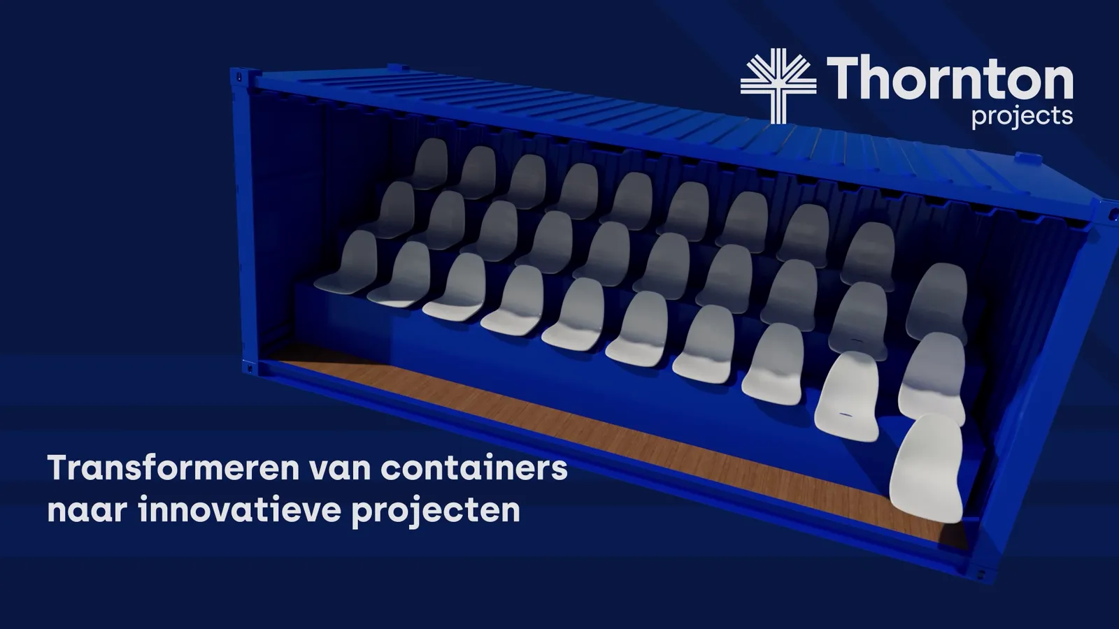
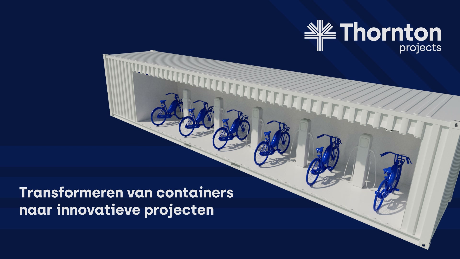
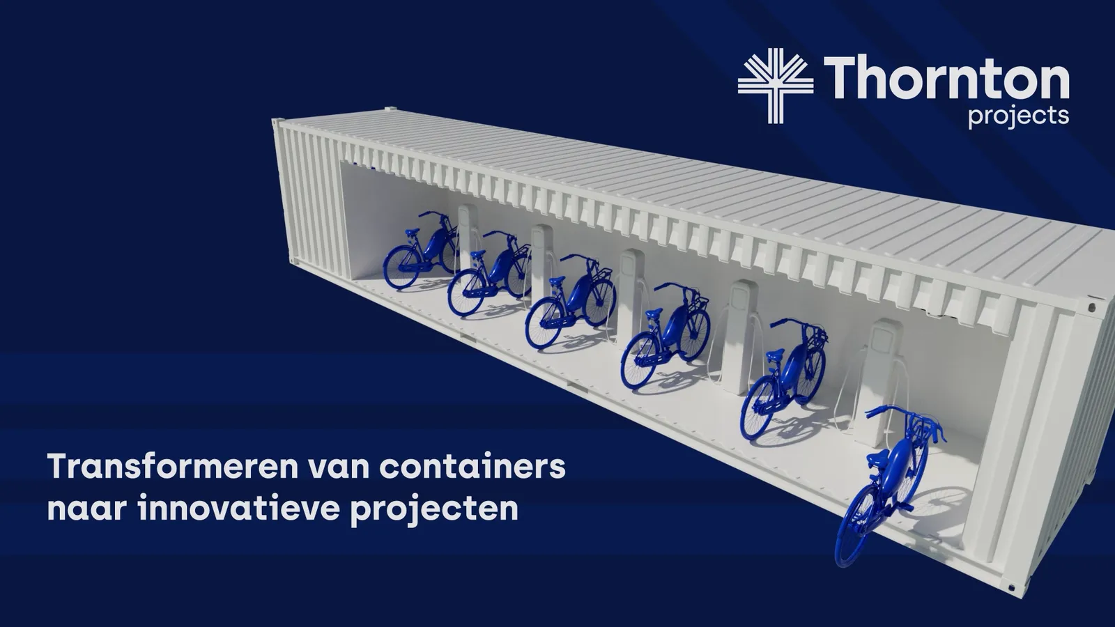
The identity took shape in a new website and in the design of flags, banners, stadium boards and 3D animations. Social advertising for lead generation became a fixed building block of the communication too.

So the rebrand became more than a new logo. It became a structure that can keep carrying Thornton's growth.

  • Brand strategy
  • Brand identity
  • Rebranding
  • Graphic/print design
  • Photography
  • Animation & motion graphics
  • Website
  • Social media
  • Campaigns
  • Events

Sometimes you have to dare to start again from a blank page.

The fearless

You don't bring five companies together under one flag with a new house style alone.

It takes the courage to let go of what feels familiar and to rebuild from a single concept.

Say hello to Thornton 2.0.

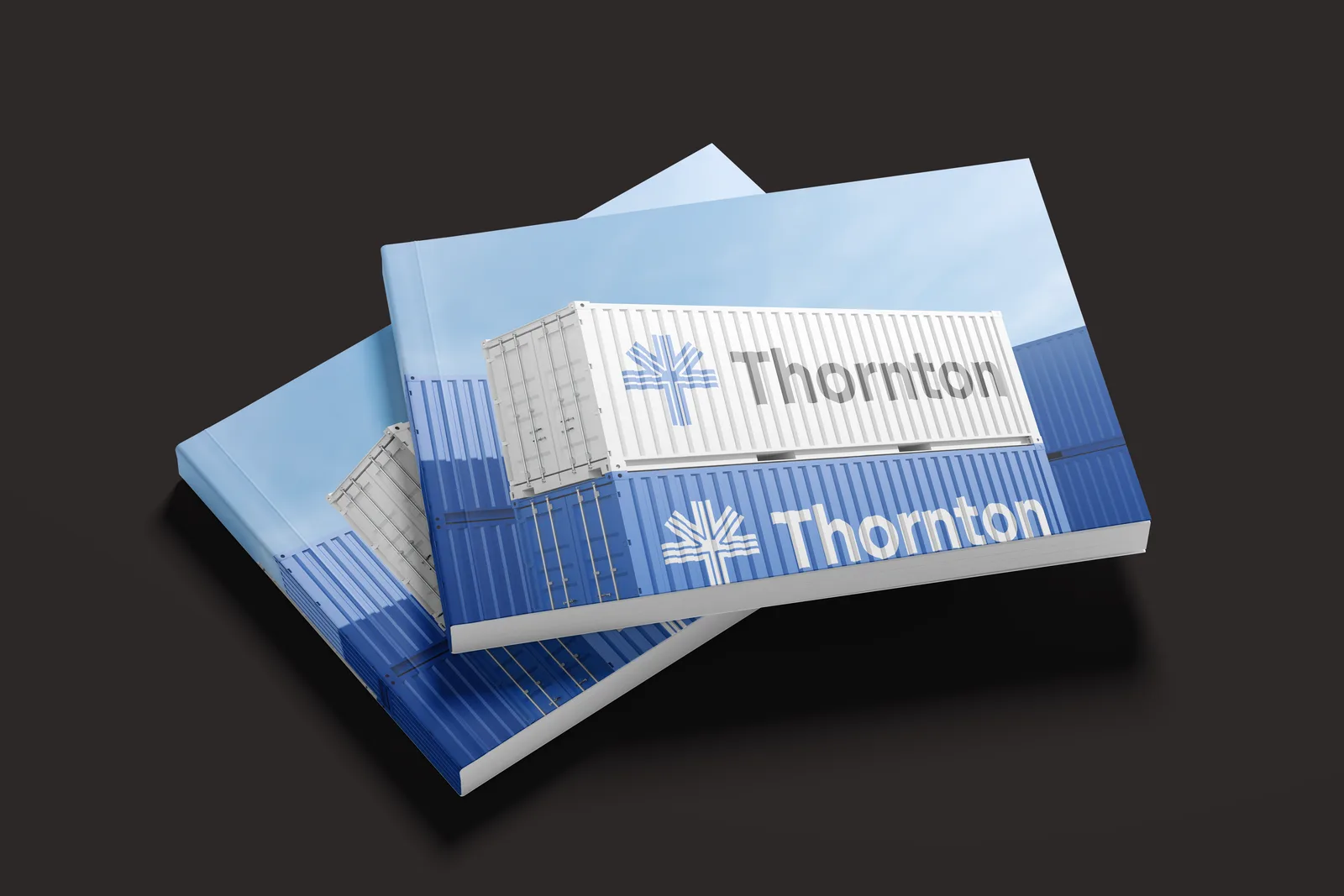
Two copies of the Thornton brandbook stacked: the cover shows white and blue shipping containers carrying the new logo.

Brand identity

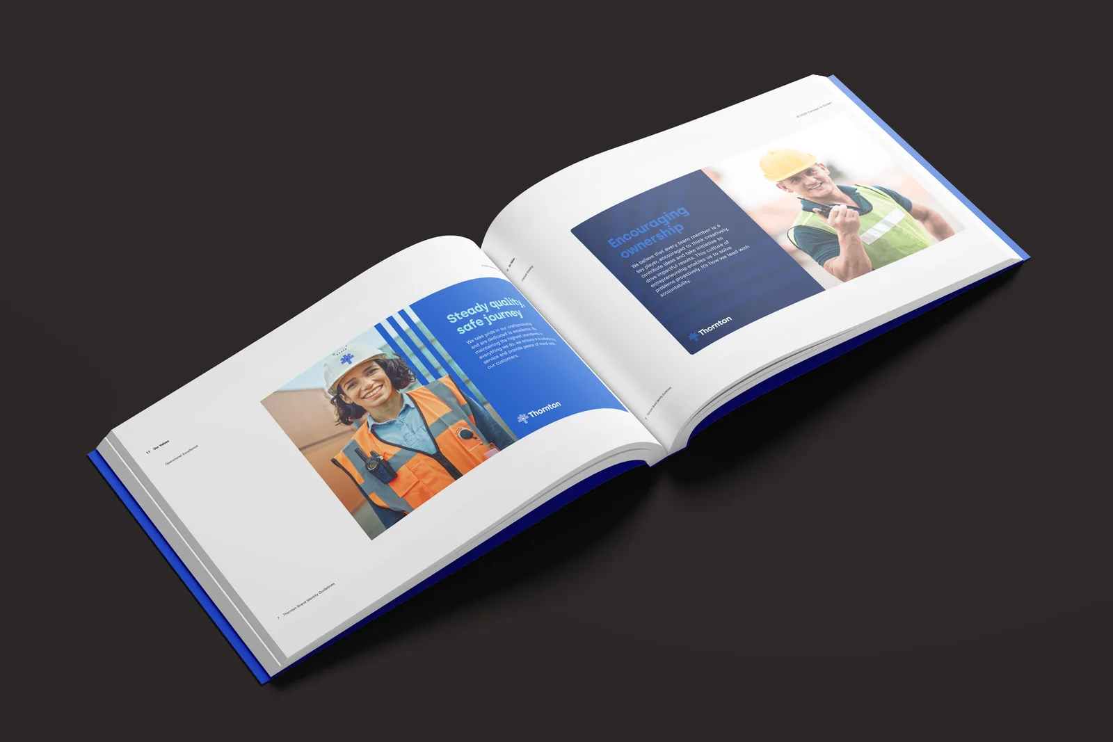
The brandbook open on a spread: crew portraits in hi-vis beside the values Steady quality, safe journey and Encouraging ownership.

Brand identity

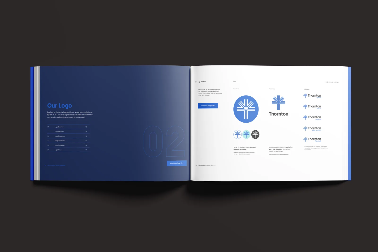
The Our Logo chapter: the mark in a roundel, the logo with wordmark and the derived logo variants.

Brand identity

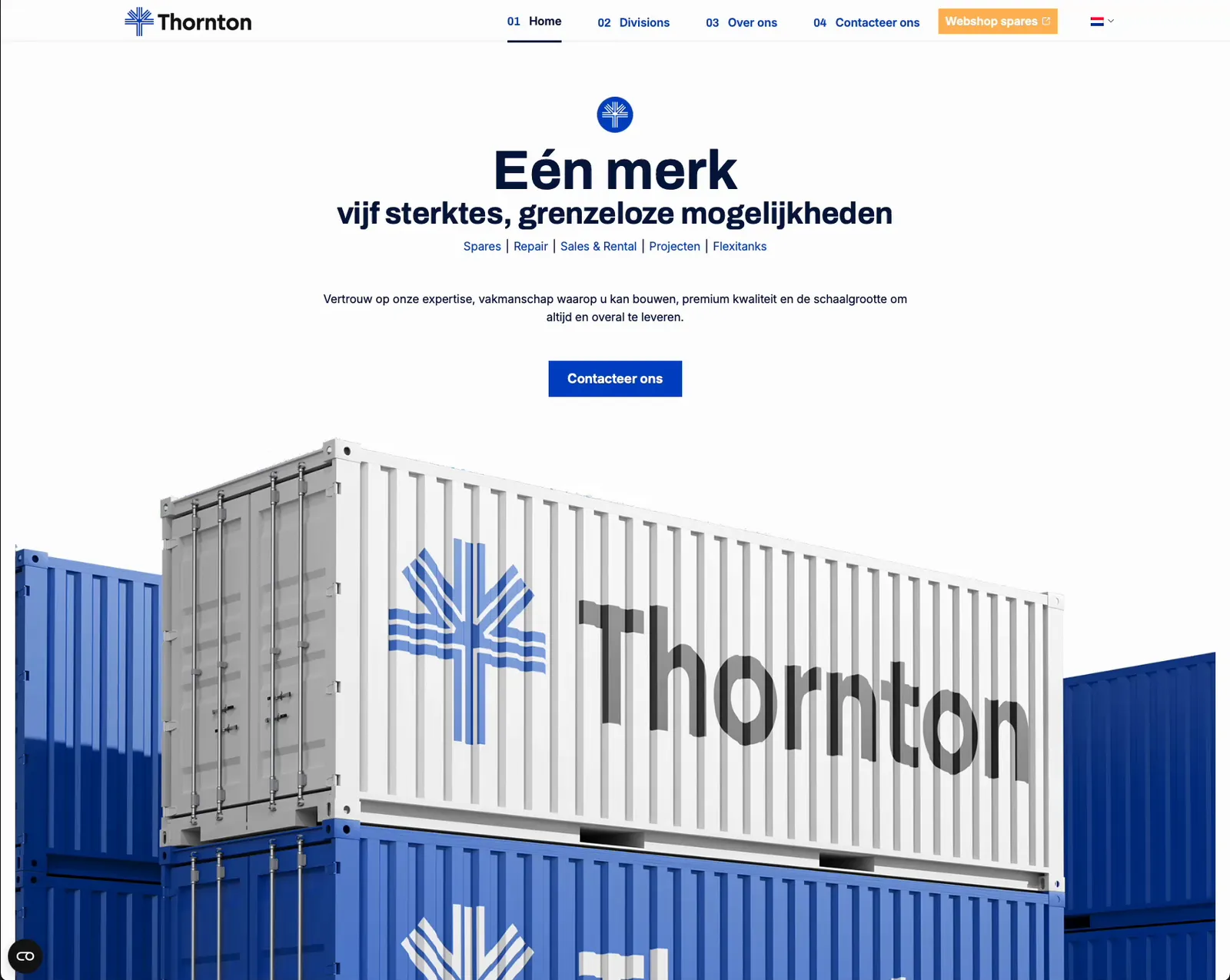
The new Thornton homepage: 'Eén merk, vijf sterktes, grenzeloze mogelijkheden' above a white shipping container carrying the new logo, stacked on blue ones.

Website

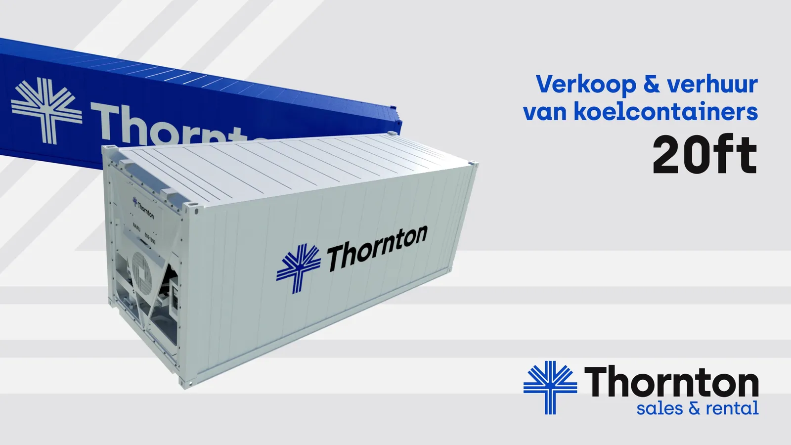
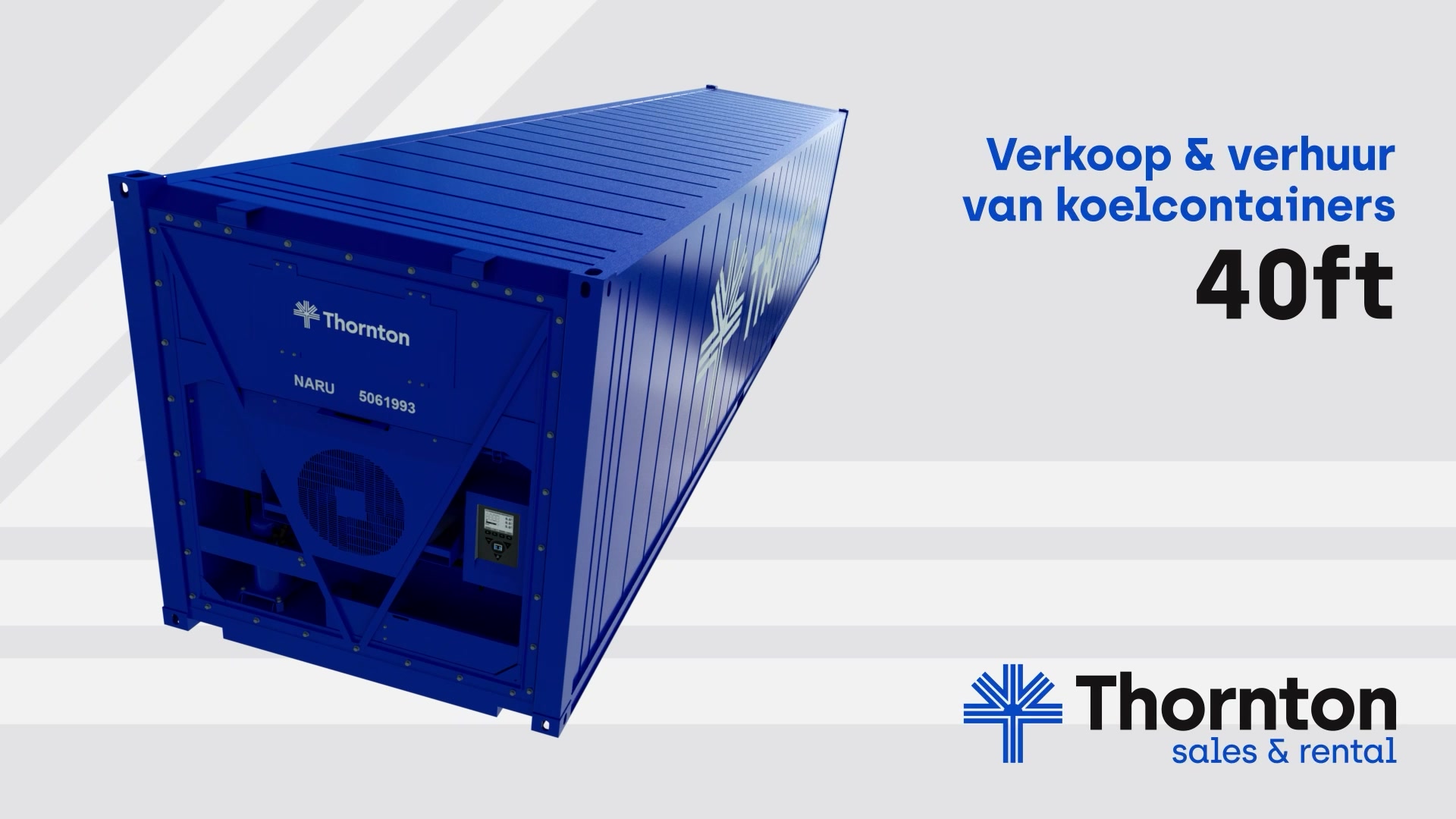
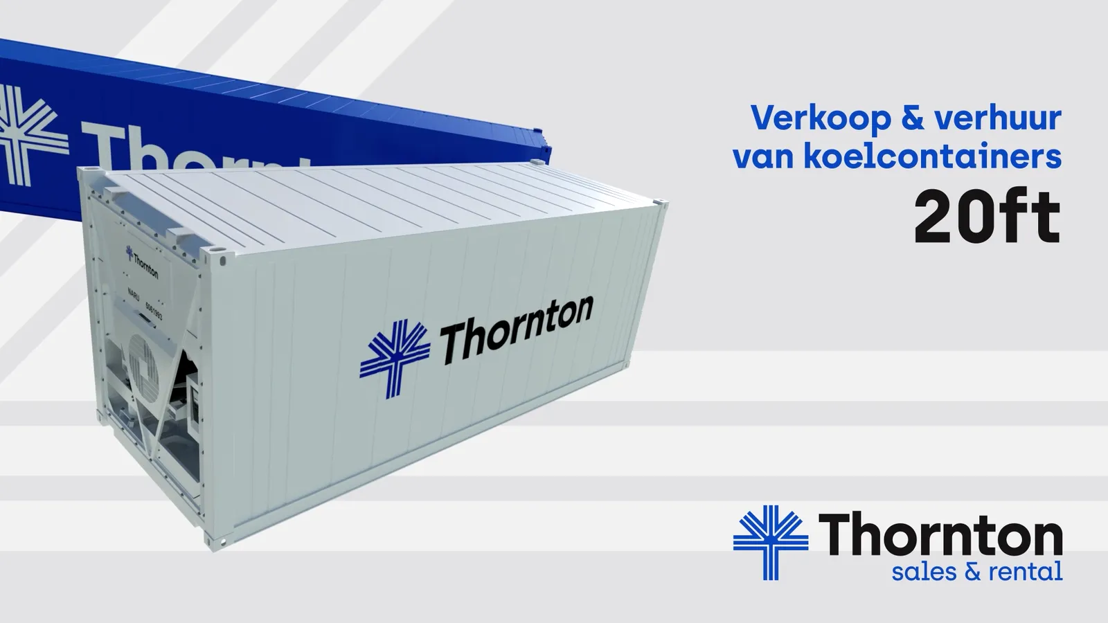
Frame from the stadium spot: a white 20ft reefer container with the Thornton logo turns in front of a blue one, beside 'Verkoop & verhuur van koelcontainers' and the Thornton sales & rental logo.

Animation & motion graphics

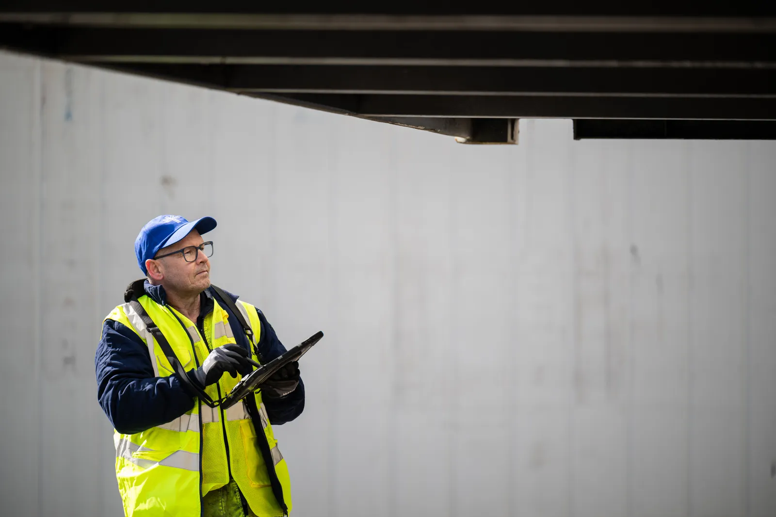
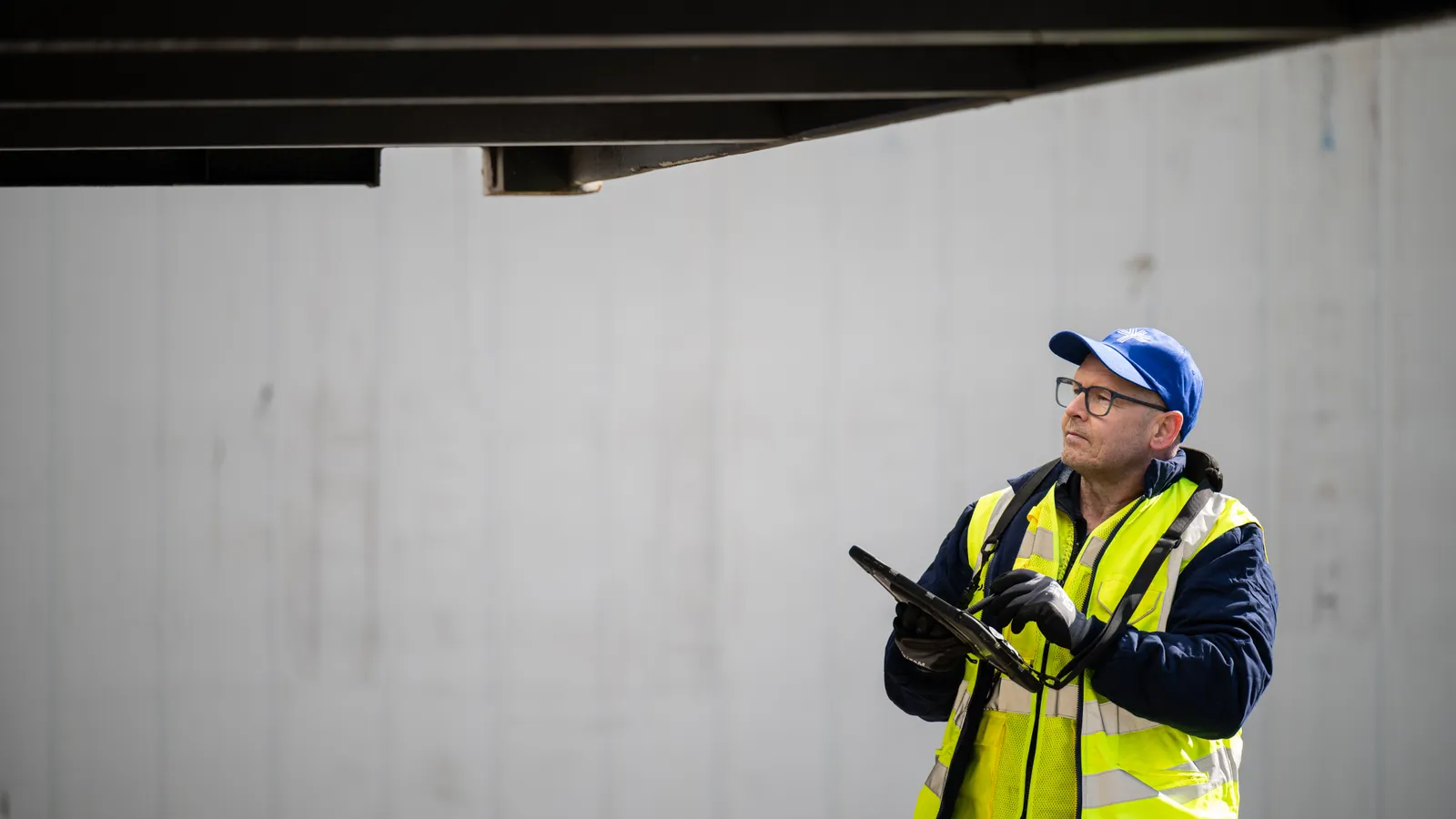
A crew member in a hi-vis vest, glasses and a blue Thornton cap looks up from the tablet in hand at the container jutting out overhead.

Photography

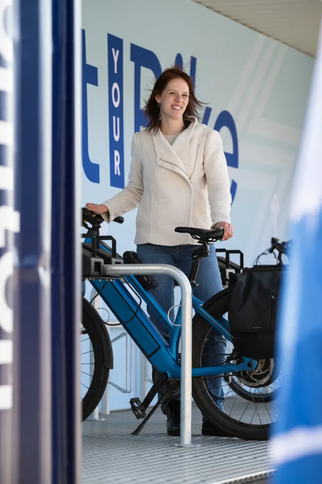
A woman in a light wool jacket smiles beside a blue e-bike in the bike container, in front of a wall of large blue letters.

Photography

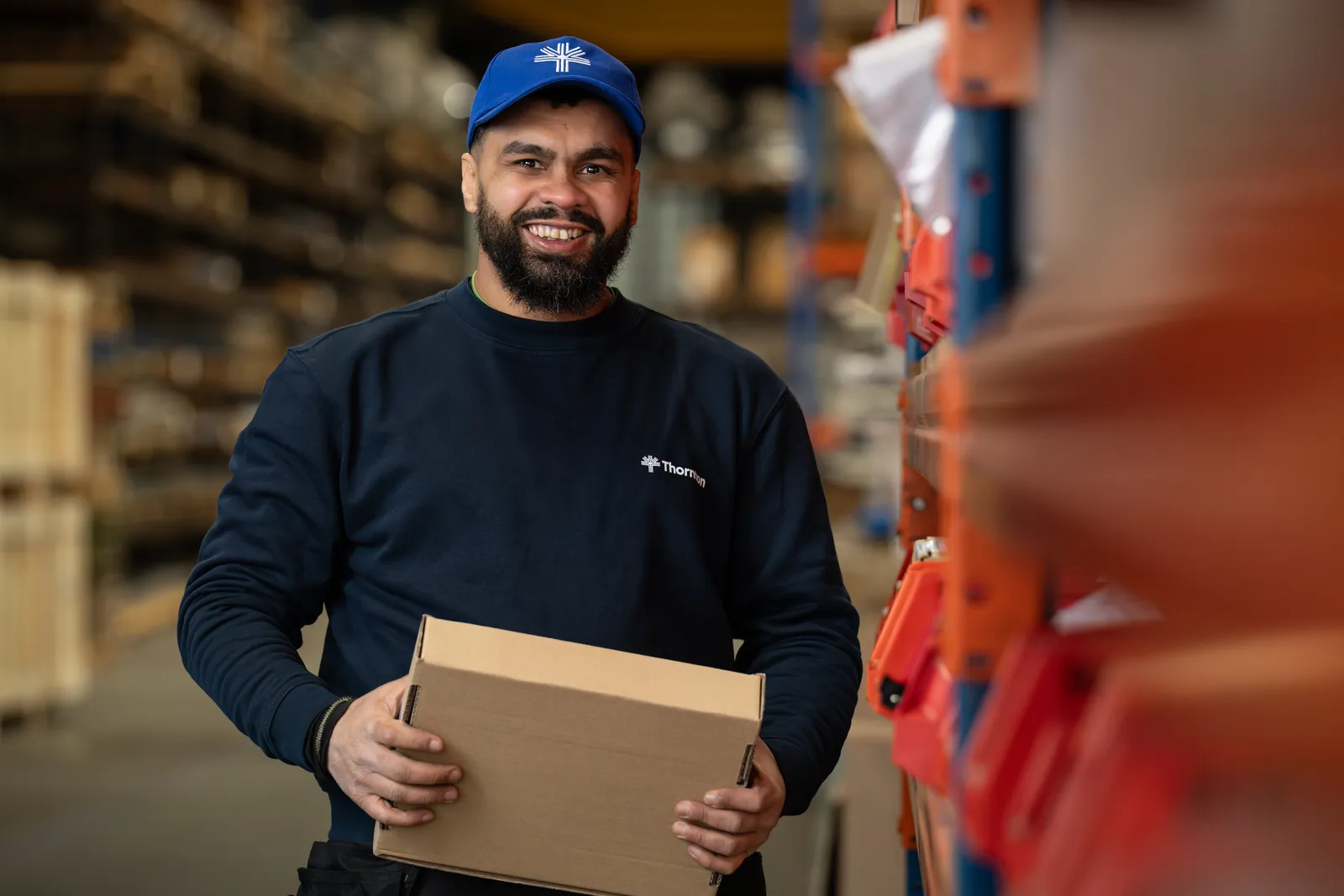
A smiling warehouse worker in a blue Thornton cap and navy sweater carries a cardboard box between the racks of orange bins.

Photography

The stadium spot

Watch the spot