Fearless John

Full Circle Case

BEEL

The power of service.

BEEL is a household name in the sale, rental and servicing of machinery for agriculture, horticulture and earthmoving. A company with a solid reputation and years of expertise. The brand's look, however, no longer matched the quality and ambitions of the company.

The story in four chapters.

“Get our brand ready for the future.” (and make it stand out)

The call

The brief? Bring BEEL's identity back into sharp focus. Build a brand that matches the organisation behind it: strong, contemporary, human and ready for the next generation. At Fearless John, we build that from the ground up.

How do you modernise an established name without losing what made it strong?

The dare

By looking beyond the logo, at the whole story.

So we went on retreat with BEEL and dug deep into the soul of the company. Why do we exist? What makes us unique? What are our values and standards? How do we treat our clients? From there we moved from positioning to identity and strategy, and on to the digital experience.

Not a rebrand, but a revival. Towards a brand that lives, breathes and moves.

The payoff

We wrote out the corporate identity down to the last detail. It became the backbone of all our marketing.

New leitmotifs. New designs. New patterns. New energy.

And above all: one story you can feel, inside the company and out. From a new, extensive website to photography, video, print and the management of social media and advertising: we carried the new identity through every touchpoint and brought BEEL back out as a brand with ambition.

  • Brand strategy
  • Brand identity
  • Graphic/print design
  • Video
  • Website
  • Social media
  • Campaigns

Out-of-the-box and 100% authentic. BEEL, all pulling together.

The fearless

With striking advertising campaigns and content that wants to be seen, we went straight for the target audience together with BEEL. On Facebook, Instagram, TikTok and LinkedIn, on the website, at trade fairs and in every client contact.

Not just to be there. But to stick.

The BEEL brandbook, closed on a black surface: the logo and the 'the power of service' baseline on the cover.

Brand identity

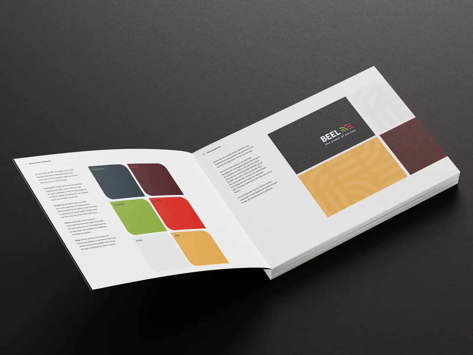
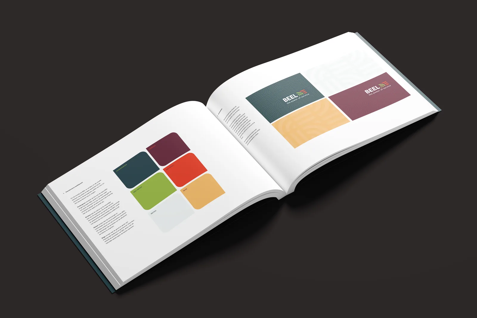
Open brandbook: the colour system on the left, on the right the logo on dark green, the line pattern in ochre and a bordeaux panel.

Brand identity

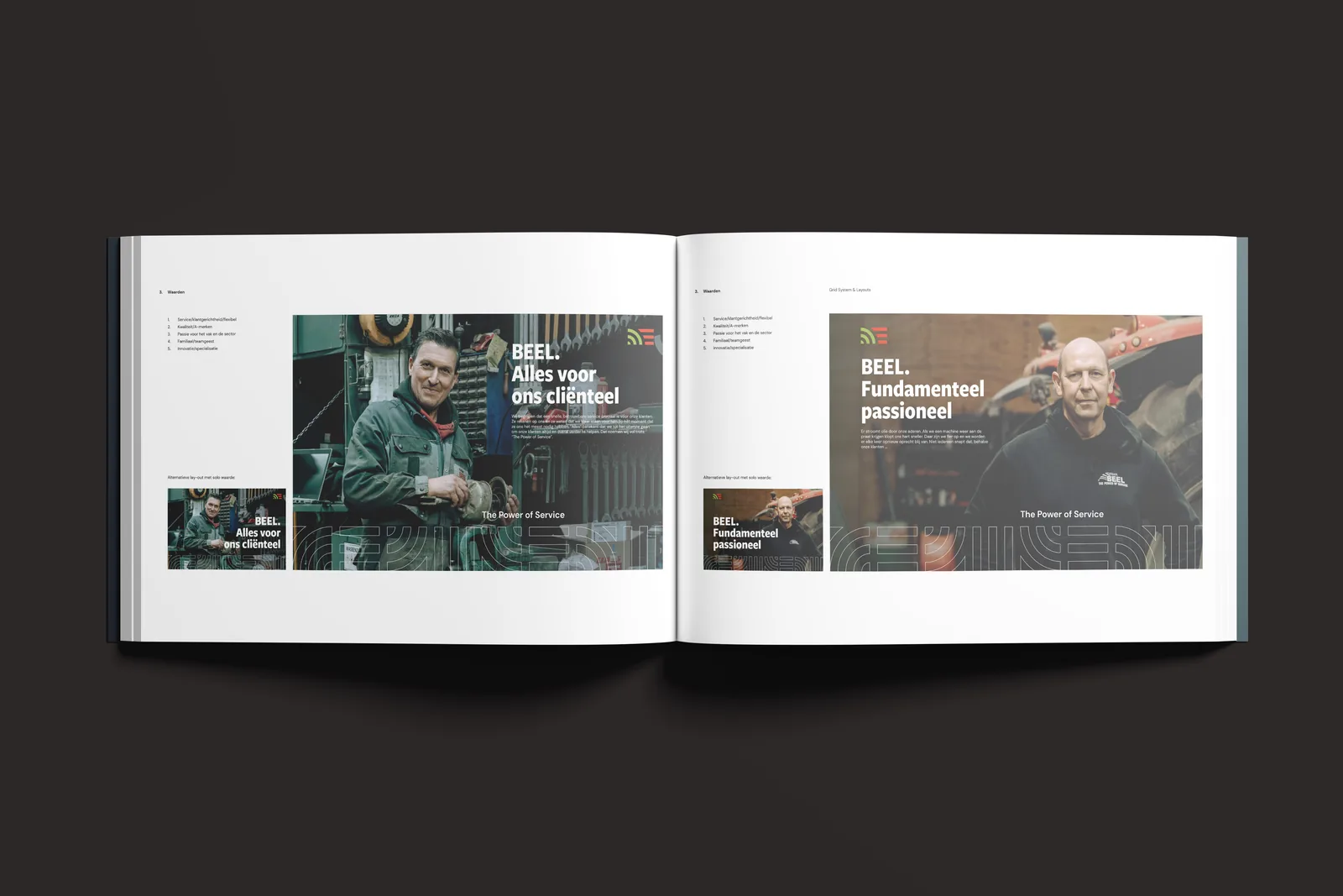
The brandbook's photography spread: 'BEEL. Alles voor ons cliënteel' with a mechanic in the workshop and 'BEEL. Fundamenteel passioneel' with a colleague beside a tractor.

Brand identity

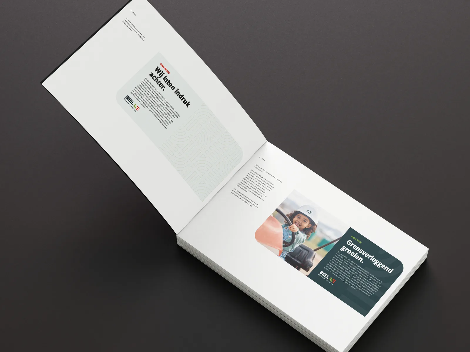
Open brandbook with the brand story pages: 'Wij laten indruk achter.' on the line pattern and 'Grensverleggend groeien.' beside a photo from the cab.

Brand identity

Two copies of the brandbook, stacked on black, with the BEEL logo on the cover.

Brand identity

The brandbook's colour spread, seen head-on: six swatches beside the logo applications on dark green, ochre and bordeaux.

Brand identity

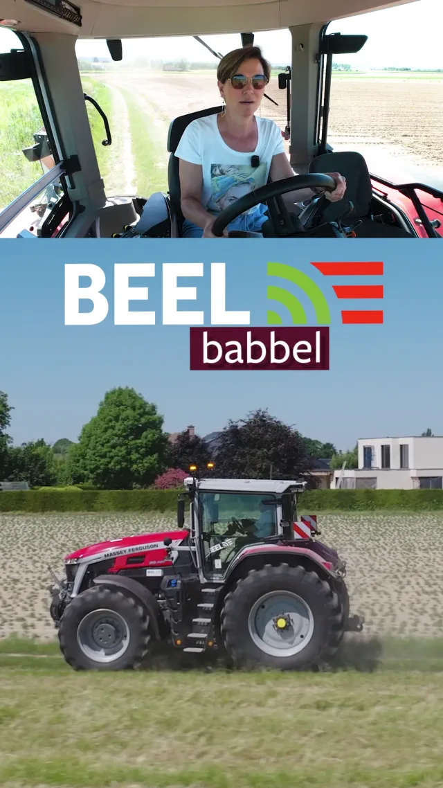
BEEL babbel snack video: the presenter in the tractor cab above a red tractor in the field.

Social media

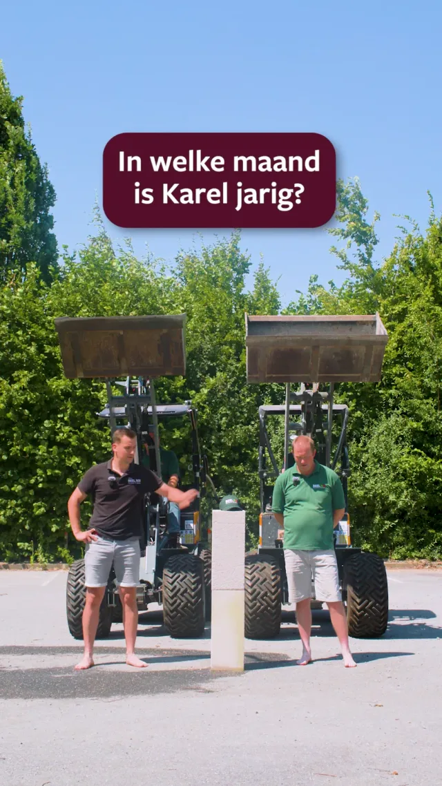
Quiz snack video: two colleagues in front of two telehandlers, under the question 'In welke maand is Karel jarig?'

Social media

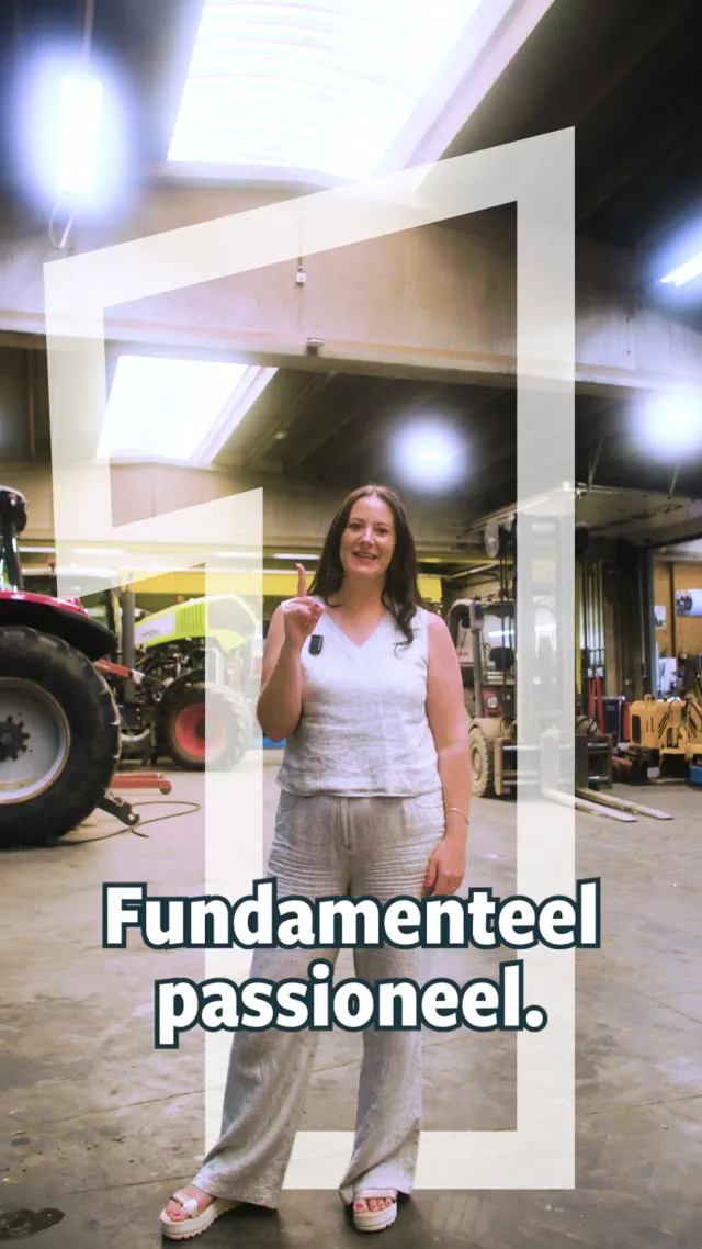
Values snack video on the workshop floor: 'Fundamenteel passioneel.'

Social media

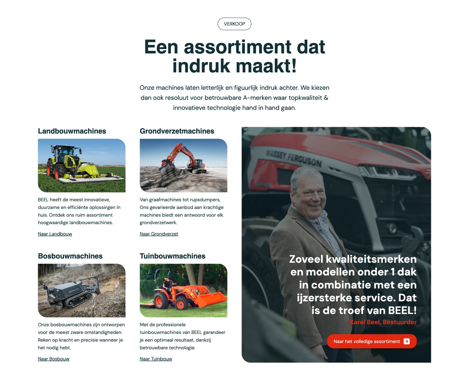
The sales section of firmabeel.be: 'Een assortiment dat indruk maakt!' above the four machine groups, beside Karel Beel at a Massey Ferguson.

Website

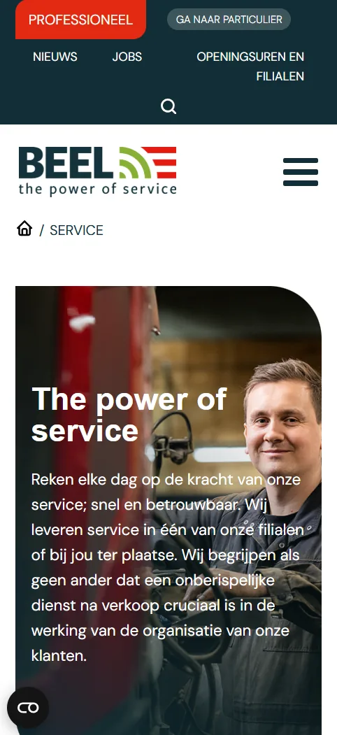
The Service page on mobile: the menu and the logo above the 'The power of service' hero with a mechanic in the workshop.

Website

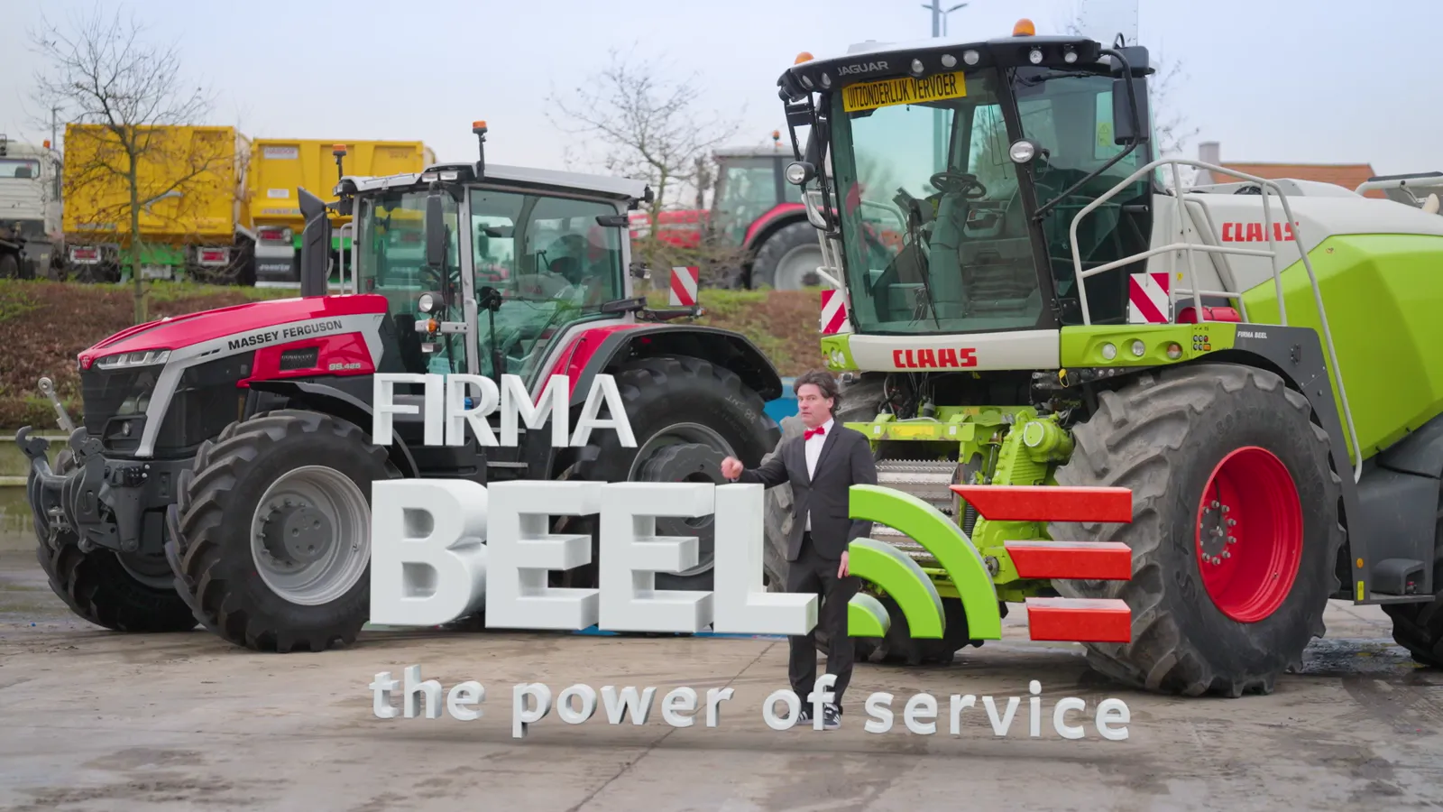
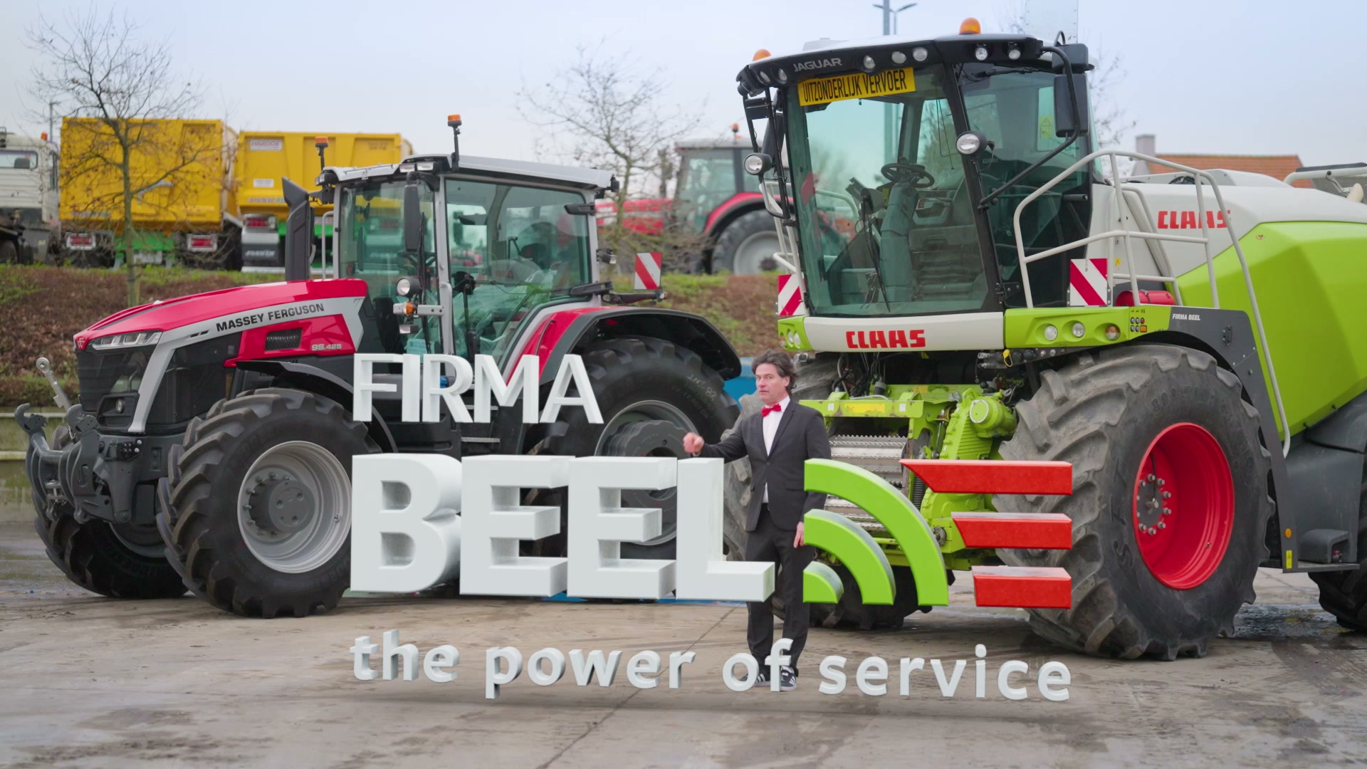
Frame from the teaser: the presenter between the machines, at the giant 'FIRMA BEEL — the power of service' letters.

Video

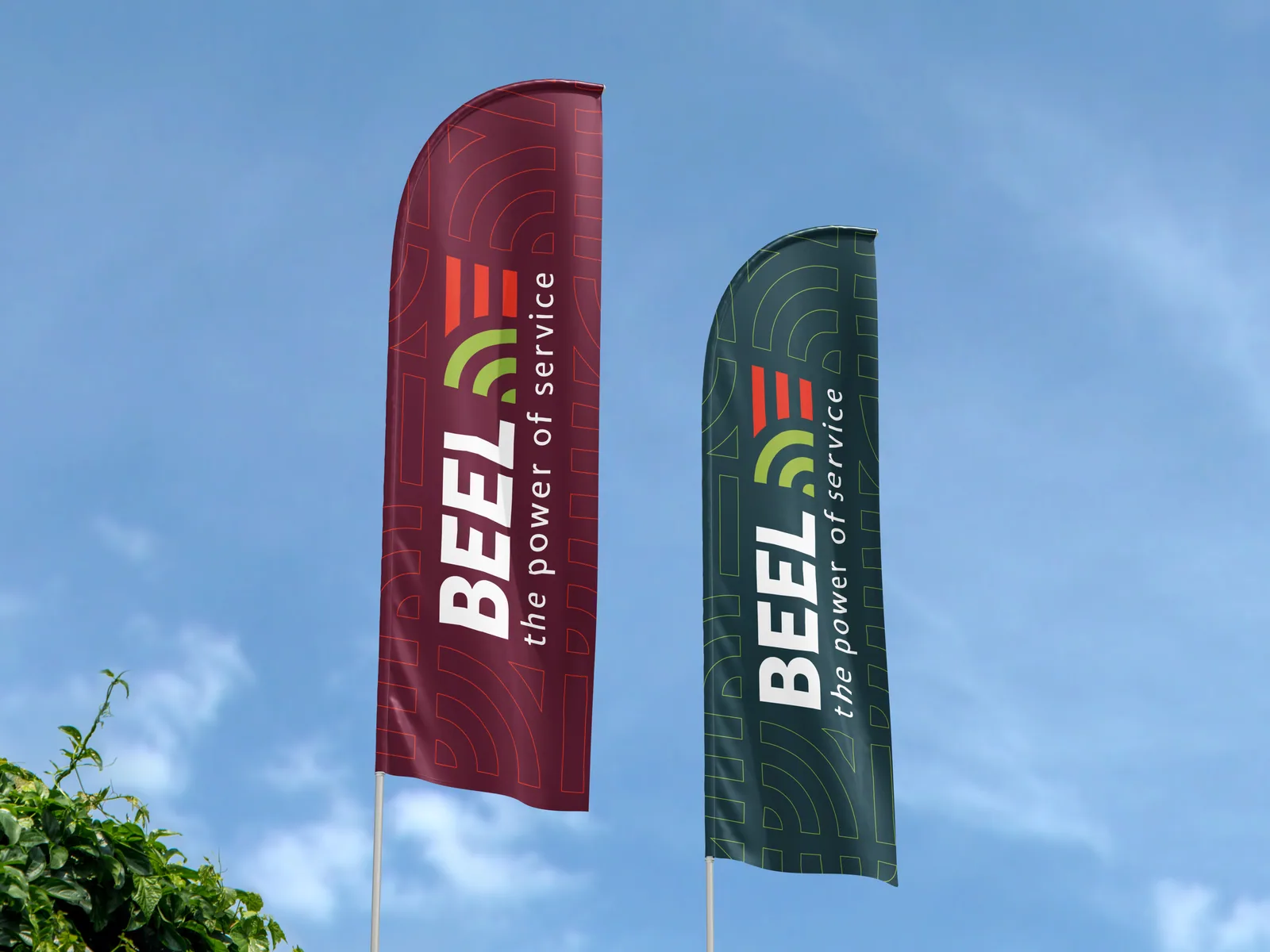
Two beach flags in bordeaux and dark green, each with the BEEL logo and the line pattern.

Graphic/print design

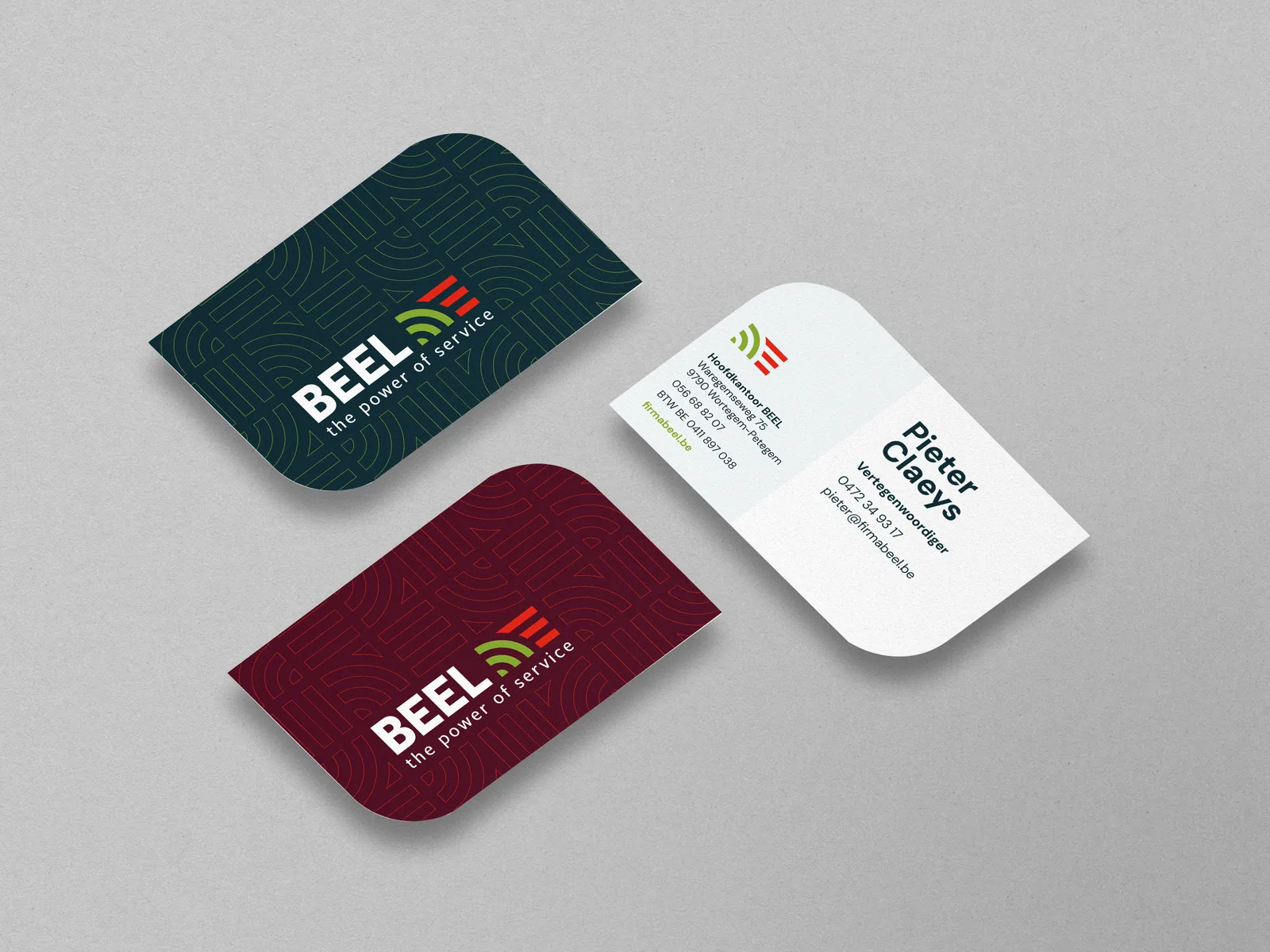
Business cards in dark green, bordeaux and white, with the line pattern and the contact details.

Graphic/print design

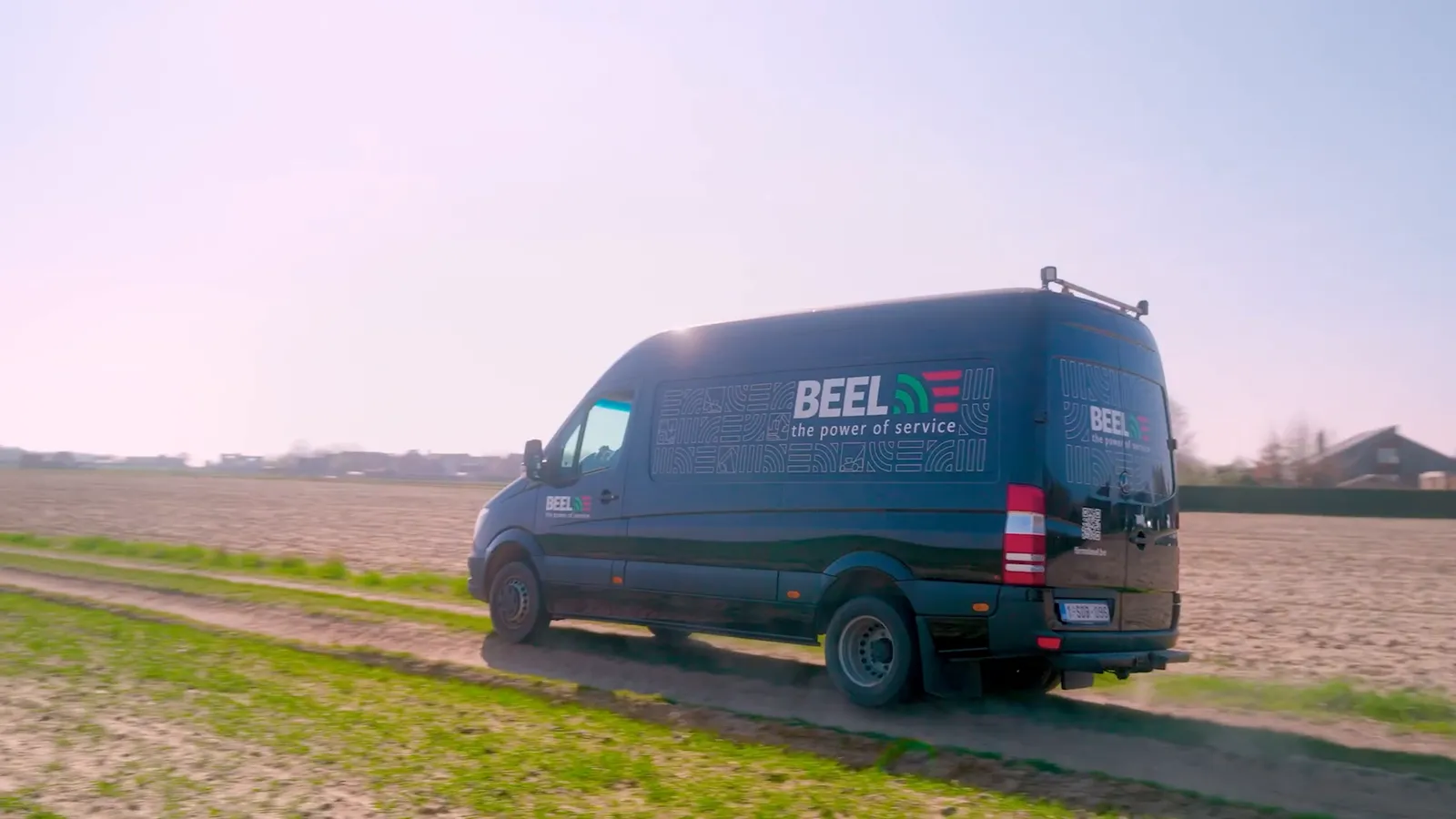
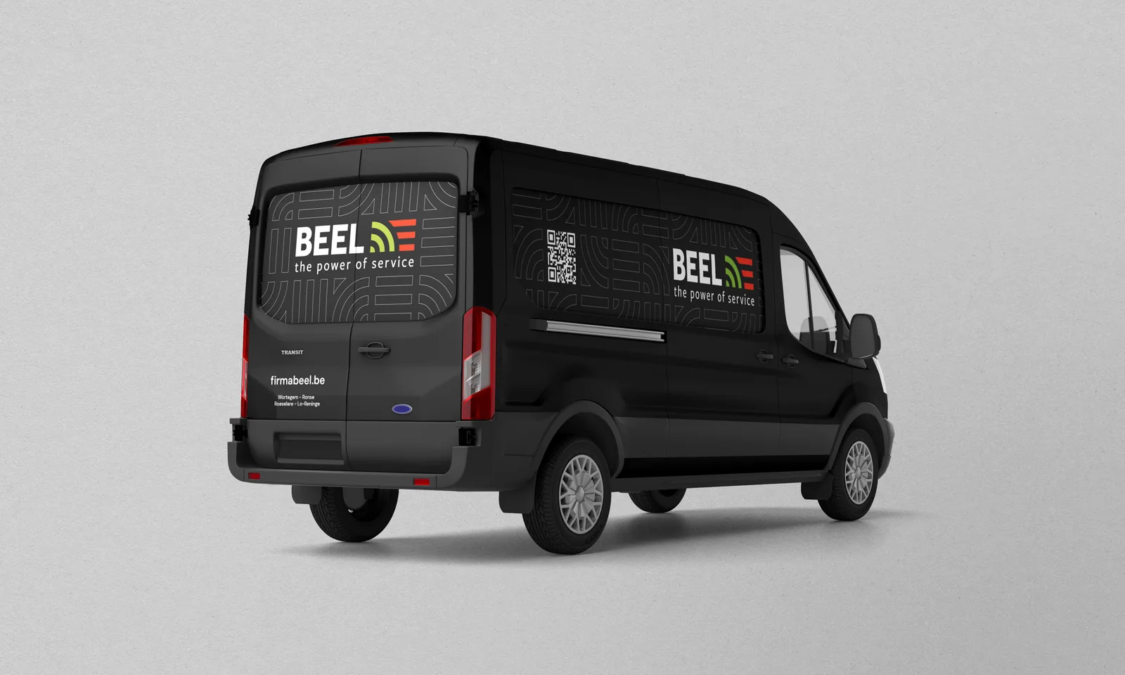
The black van with the BEEL logo, firmabeel.be and the QR code on the cargo body.

Graphic/print design

The result

Watch the film